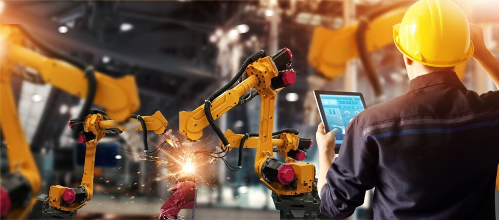
By now you know that data is key to ensuring that your factory is running at top efficiency. But, it is not enough to just collect and analyze data, the way that it is presented is also important. Reports that are configured to automatically show the most relevant data in a clear and easy to understand way are much more useable and therefore actionable. A clear visual report means that technicians and managers can instantly see what’s going on and respond accordingly.
While there are some people who can look at columns of numbers and instantly pick out a pattern, most people are more visual and need to see a chart in order to get the picture (pun intended). In fact, data visualization has actually been around for centuries going back to the invention of the pie chart in the early 1800’s. New technologies are making it easier than ever to use data visualization to make it easier to analyze data and share the results.
If you are unsure of why you need to consider the importance of presenting data visually, take a minute to read the following reasons why:
It\’s Fast
When information is in a chart or other visual format, people looking at it are able to digest the information much more quickly. With ever-shrinking attention spans, it is important for patterns and key information to pop out quickly.
It\’s Simple
If you have a page full of numbers, even if they are organized in columns in a spreadsheet, your eyes are likely to glaze over as you stare at it and try to locate patterns. But if you have a simple graph, for example, you can easily and immediately notice upwards or downward trends. From there, you can decide what is worth delving into to analyze in more detail in order to put together a full story of trends, causes and effects. You can also easily make very slight adjustments to experiment and see results of different scenarios.
It Makes Next Steps Clear
A visual display can mean taking pages and pages of information and condensing it into one page of clear charts and graphs. Even if the same information is shared across teams, each can look at the area that is most relevant to them, quickly identify relevant issues and then determine the next steps. For example, if the charts indicate that production is down because one particular machine has been broken and, at the same time, the number of breaks people are taking has increased, it is immediately clear that whoever is responsible for maintenance needs to fix that machine and HR needs to discuss break times with employees.
Now that you know why visual data is important, consider how you might use it in your factory. Some questions for you to think about as you embark on this process are: what exactly is the data you want to visualize – how big is it, how much information? What kind of information do you want to communicate in the visualization? Who is the audience who will be looking at this information and what do they need to know?


